| Home | About | Archives | RSS Feed |

The Many Faces of Walmart

|
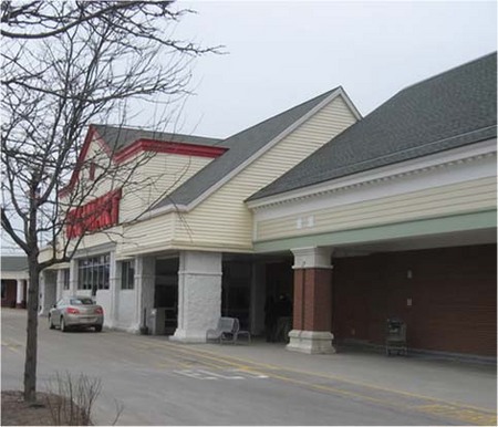
This screams New England. Or maybe just screams. |
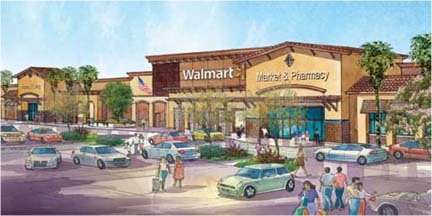
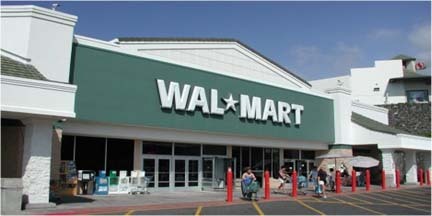
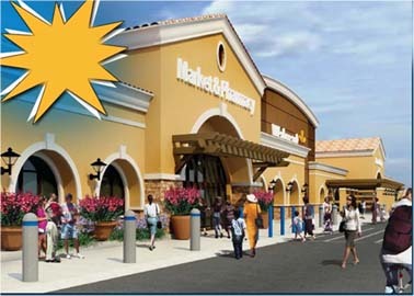
NORTH ADAMS, Mass. — City Councilor Keith Bona sent us these renderings and photos he found online showing that the mega-retailer's changed its facade more than once to accommodate local conditions.
"As you know I am in favor of the new Walmart," Bona wrote us. "However, I support community input, and found their first concept of the building plain and ugly compared to other developments I have seen."
The Planning Board, too, on Monday night disliked Walmart's new prototype (close to that above) and asked the company to come back with a more suitable New England look, as it did for its current store in the city and as Super Stop & Shop had done. They like the whole modular concrete and recycled paper facade (yes, paper) but the desert look left them dry.
Walmart's rep at the meeting, attorney Jay Sabin, said reconfiguring the roof line would be expensive. More expensive than reconfiguring a section of Curran Highway to MassHighway standards? Likely not. If Walmart wants to cover 14 acres with pavement and buildings, the least it can do is put up something halfway decent. We can't expect 100 percent — there's only so much you can do with a giant cardboard box.
More Walmart
|
|
 |
 |
|
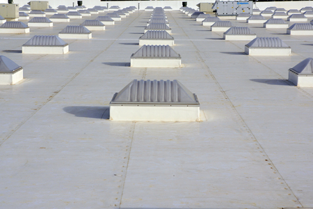
Below: Walmart's white roof and skylights designed to save energy. The new Walmart would have 160 skylights.
| Tags: design, facade |

